
Created by Kyle Barton on Wed, 02/27/2019 - 03:56
Description:
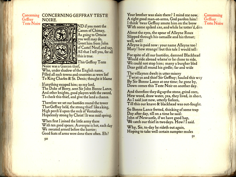
Throughout his life Morris made many efforts to present his writings in artistic form: inscribing them in illuminated manuscripts, co-designing with Edward Burne-Jones woodblock illustrations for a projected edition of his poem The Earthly Paradise, and beginning, also with Burne-Jones, an illuminated and illustrated version of his translation of Virgil’s Aeneid. In 1891 he co-founded the Kelmscott Press with Emery Walker, an experienced printer, and for this he created new typefaces and designs which refined fifteenth century examples.
In his role as director of the Press Morris insisted on firm, clear typefaces and an “architecture,” or harmoniously designed page. Pages were to be viewed as unified “openings,” with relatively small upper margins, larger ones below, and slightly smaller ones at the side. He rejected delicate contemporary typefaces and larger ‘leadings’ (or spaces between lines). Instead he insisted on minimal letter-spacing, saturated black inks on white, crisp paper, and very bold typefaces, such as ‘Troy’ (Gothic), ‘Golden’ (Roman) and ‘Chaucer’ (a smaller Troy). No one who has ever looked at a Kelmscott book will forget the radiance of its paper and the sharp contrast of its dark letters.
Copyright:
Associated Place(s)
Part of Group:
Artist:
- William Morris