
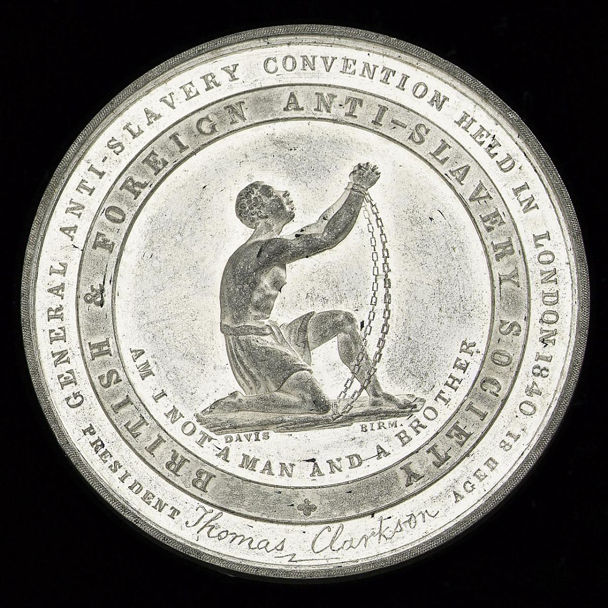
his logo was designed in 1787 by Josiah Wedgewood for the British and Foreign Anti-Slavery Society. The slave in the design is presented as helpless and was drawn that way to appeal to the superiority of white abolitionists, ignoring the fact that many Africans were in fact challenging slavery themselves. While this created a negative stereotype, it was also useful in rousing white abolitionists. By presenting a slave half-naked and vulnerable, kneeling as if in prayer, the movement was able to gain a wide range of sympathizers. Portrayed as weak, the logo elicits a paternalistic sense. Most slaves didn't know their parents, whether through death or sale, children grew up knowing only their master. Thus, the logo presents the slave as in need of a guiding hand, just as a parent would do for their child. Just as logos are used today, Wedgeworth's design was branded on chinaware, snuffboxes, cufflinks, and much more, used as a political and a fashion statement.
At the time, only half of the British population was literate, so printed word only got the abolitionists so far. Illustrations and the arts were both methods used by the Anti-Slavery Society. The Wedgeworth logo was carefully designed to appeal to the pathos. Through the evocation of sympathy or even horror within audience's, abolitionists were able to create change without needing to rely on individuals. Thus this logo was crucial to branding the campaign. While just one cog in a giant machine, the distribution of the logo on trivial, everyday things helped with the mobilization of the public.
Work Cited:
https://www.bbc.co.uk/history/british/abolition/abolition_tools_gallery…