Created by Alicia Puebla on Wed, 11/11/2020 - 21:16
Description:
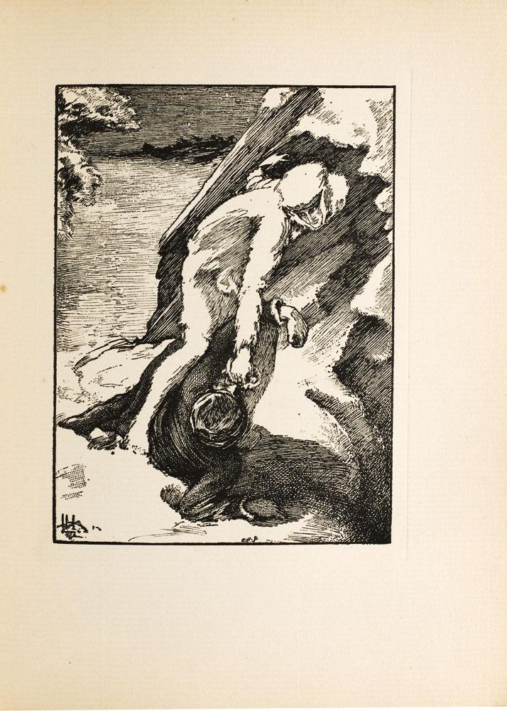
“The Finish” is a wood cut graving done by Clemence Housmans of her brother Lawrence Housmans illustrations based on her short story ‘The Werewolf’. The story was officially published in 1896 by John Lane the Bodley Head but did appear in a where Laurence Housman worked but a copy of the story did appear in a volume of 'Atalanta' which was a womans magazine in 1890. The engraving depicts an important moment of the story in when Christian runs in front of White Fell and she tackles him with a feint punch with her right hand and leaps on top of him. The moment comes right before White Fell kills Christian and in turn his blood kills her. When first glancing at the image it can be confusing to understand what is happening because of the shading but the context of the story allows for understanding that White Fell, the Were-Wolf has over powered Christian, as his hand and arm are broken and she is above him with her arm appearing as though she is throwing a punch. This image shows Christians dedication and love for his family because he protects them at all costs, showing the purity of his character. White fell on the other hand is the opposite, this unveils her brutality and parts of her beastiality.
This image can also be seen as a comment on victorian ideologies about homosexuality. The depiction of White Fell as a very feminine women who is beautiful, adored and lusted after while also being a were-wolf that can over power and kill a man. This is shown in this Laurence Housman image through the depiction of White fell, she stands tall ad proud over Christians body and her face maintains its beauty while she is still attempting to kill him. This can be portrayed as a comment on homosexuality which at the time was not permitted and seen as wrong. This depiction shows that a woman can still be a woman despite ‘having masculine traits’ which homosexuality was seen as. White Fell is above Christian in a display of dominance, being the only full face shown in the image which dominates the readers attention, and also the androgyny of White Fells character, these displays of dominance and traditional masculinity are meant to comment on the ideals on homosexuality .
Traditionally speaking women are not seen as strong figures let alone strong enough to kill a man, but this illustration shows the moment in which Christian in over powered and White Fell is literally above him in a display of her power. The only detailed part of the image is White Fells face which I believe puts even more emphasis on the importance of her character and her strength in the eyes of the reader. This image is also interesting because of the dichotomy between these two beings. Christian is portrayed as dark and White Fell as light and to emphasize that she had feinted an attack the illustrator and engraver cast a layer of white around her hand. This image is important because of the emphasis that is placed on White Fell, the only part of this image that is intensely detailed is her face as Christian’s face is turned at an angle away from readers. This moment depicts White Fells defeat over Christian and her power. This image is a comment on Victorian gender roles. The image is labeled ‘the finish’ though it is not the end for White Fell, it only depicts Christian’s fall
Sources
Janzen Kooistra, Lorraine. “Editorial Introduction to The Were-Wolf.’” COVE, April 2018, https://editions.covecollective.org/edition/were-wolf/editorial-introduction-were-wolf.
Janzen Kooistra, Lorraine. “Doubles and Doubling Back: On (Re)Reading Clemence Housman’s The Were-Wolf.” Victorian Review, Victorian Review: An Interdisciplinary Journal of Victorian Studies, 2 July 2019, victorianreview.org/?p=1723.


