
")
My selected edition is titled The Rubáiyát of a Scotch Terrier, by Sewell Collins. It doesn’t give an edition number or a translator, which I took to understand as being because the edition is a parody. The publisher is Frederick A. Stokes Company, where it was published in 1926, New York. There are 71 pages total, though they aren’t numbered, which is interesting considering many of the other editions contained page numbers. Another interesting thing about the format of the text is the stanzas. This edition only contains 41 stanzas, which is more than half the amount of stanzas as in the original (which has 75).
This edition contains many beautiful illustrations, which were actually done by the author himself! In researching Sewell Collins, I found that he was an illustrator as well as a writer! He was most well known for the plays he wrote, including his most famous, titled Miss Patsy, which was performed on Broadway in August of 1910. Collins was born in Denver, Colorado on September 1st, 1876. Collins first attended University of Notre Dame and then on to military school. After that, the dramatist moved to Chicago where he studied at the Chicago Art Institute. The start of his illustration career started here, when he worked as a reporter and cartoonist for the Chicago Daily News.
All except for the first two illustrations (out of twenty-three) are on the right page when you open the text which I found to be an interesting pattern. The style of the drawings is very different from the original and traditional illustrations. Collins uses a much more modernist and realist style to depict the Scotch Terrier. The pictures have been printed in ink but they seem to have been originally drawn in pencil. The style is very classical and realist because they portray the images as they would be in real life. They aren’t abstract, surrealist or use a less realistic style like some of the other editions.
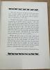
Some other interesting features are the inscriptions at the front and back of the book. The page next to the copyright page includes a dedication that reads, “To the memory of ‘Socks,’” which seems to be a dedication to a deceased dog that Collins may have had. Though I did try to look this up, I couldn’t find anything confirming this. There is a blank page after this and then a page with a quote from Senator George Graham Vest describing dogs as man’s best friend and how loyal and loving they are to their owners (image 1). This ties into the most interesting feature which is of course the subject being about a Scotch Terrier! Here instead of Khayyam or a human being the narrator, the dog is the narrator.
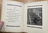
One of the elements I found interesting is the way Collins pulled a lot of the language from Edward Fitzgerald’s translation. Though the narrative and subject are completely different, there are many phrases here that we see in Fitzgerald’s translation. One of the most notable being, "Come, fill the Cup," which is used word for word in stanza seven of Fitzgerald's translation. The shorter phrase, "fill the Cup" is used several other times in Fitgerald's edition as well. This added to the humor a lot because it made the dog sound so proper when talking about silly things like food and wanting attention (image 2).
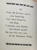
Another element that I already touched on are the drawings and more specifically their impact on the narrative. Given that there are 41 stanzas, and each stanza takes up a whole page, the illustrations were a very large part of the narration. There was almost an image on every other page. One example of this where I needed the image to understand the stanza coupled with it is in stanza XXI. In the drawing we can see the terrier being chased by a squirrel and in the text there is no mention of a squirrel, so if there hadn’t been an illustration I would have been lost (image 3).
The last element I enjoyed were the borders. Many of the other editions we were looking at in class have extremely ornate and beautiful borders on each of the pages, however in this edition the border is very simple. This technique could also connect to the realist and modern style of the images. Because the drawings are simple in color and what is actually being depicted, it makes sense for the borders to also be simple in style and color. They are black ink like the text as well. The borders contain several small dogs all in a line. They are not all terriers however. Instead they seem to be different breeds, some bigger and some smaller, but all relatively the same size.