


The Rubáiyát of Omar Khayyám: 1951 Shakespeare House Sullivan Edition, illustrated by Edmund J. Sullivan, is a beautifully crafted book that combines poetry, art, and philosophy. Published by Shakespeare House in 1951, this edition of the Rubáiyát features Edward FitzGerald's translation of the Persian poet Omar Khayyám's quatrains, along with striking illustrations by Edmund J. Sullivan. The book is bound in a rich burgundy cloth, along with a black leather spine that has what appears to be gold stars embossed. The cover of this edition comes along with a stamped design of Shakespear on the front cover in gold. The book has a total of 160 pages total and is the complete original translation of Edward Fitzgerald. The text is printed in black ink on cream-colored paper, and the book features a ribbon marker to keep one's place. The font is clear and easy to read, and the paper is of good quality, with a slight texture that adds to the tactile experience of reading.
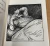
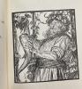
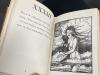
One of the most striking features of this edition is the illustrations by Edmund J. Sullivan( also known as E.J Sullivan) a British book illustrator. Sullivan's style is both elegant and whimsical, with delicate line drawings and intricate patterns reminiscent of traditional Islamic art as well as a style reminiscent of the Art Nouveau movement. The illustrations are printed in black and white, which adds to the timeless quality of the book. They are incredibly detailed and add a unique visual element to the book, each illustration captures the mood and tone of the corresponding quatrain, adding to the overall aesthetic of the book. Sullivan's illustrations depict scenes from the poems and feature intricate designs and patterns. Sullivan was particularly known for his illustrations of fairy tales. (See images 1 and 2)
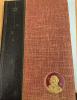
Another interesting feature of this edition is the quality of its production. The book is bound in a deep red cloth with gold lettering on the spine as well as the gold stamp of Shakespeare on the cover. The pages are thick and have a slightly rough texture, which gives them a tactile quality that is rare in modern books. The font is a classic serif, which adds to the book's overall elegance. The flyleaf texture on the cover and inner page carries on throughout the novel but is less noticeable due to the lack of dye on the inner pages. Upon closer inspection of the pages however one can see the flyleaf texture throughout the book. ( See Images 3, 4, and 5)
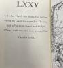
Lastly, the typography is another feature that makes the edition special. The font used in the book is a serif font, which is a traditional and classic choice for printed materials. The letters are clear and easy to read, with a medium weight that shows in the stanzas as none of the letterings is faded in the slightest. The text is also well-spaced and well-justified, which makes it easy to read and aesthetically pleasing. The font size is also noteworthy. The text is printed in a medium-sized font that is easy on the eyes and allows for comfortable reading. The font is not too small, which can strain the eyes, nor is it too large, which can make the book feel bulky. The lines are spaced out enough to avoid feeling cramped, but not so much that the text feels scattered. The justified alignment of the text gives it a clean, organized look that is easy on the eyes. It is clear that the designer took great care in choosing the font, font size, and spacing to ensure that the text was easy to read and enjoyable to engage with. The result is a book that is not only visually stunning but also a pleasure to read. (See images 6 and 7)