

My edition of the Rubáiyát of Omar Khayyám is titled: Rubáiyát of Omar Khayyám, The Astronomer-Poet of Persia. The author(s) are Omar Khayyám and Edward FitzGerald. The Translator is Edward FitzGerald. On the OSU Catalogue, Michael Kerney is listed as an author as well for the beginning portion of the book he wrote about Edward FitzGerald. The publisher is listed as New York: Doxey's in 1900. The illustrator of the book is Florence Lundborg, who took very heavy inspiration from Aubrey Beardsley's Art Nouveau style of illustrations. These illustrations are all black and white with an emphasis on the creation of these works through sharp lines and the popping contrast between the deep black spaces and the white spaces. They were all given a border as well, like a poster. The total number of pages is 120, although it is labeled as 121 on the other website that is linked in our files on Canvas. This is likely the fifth edition of FitzGerald's translations as it was published in 1900 (FitzGerald's 5th edition came out in 1889) and because it is 101 quatrains.
The edition I chose opens up with a long backstory about Edward FitzGerald’s history, written by Michael Kerney. After this, there are two poems written by two other men, Justin Huntly McCarthy and Porter Garnett, the former is written in the same structure of the quatrains FitzGerald constructed in the Rubáiyát. Porter Garnett decided to break away from that structure a bit in his by way of indenting almost every other line, unlike Fitzgerald’s third line in every quatrain, and he also mashed them all together into one really long Ruba'i, which doesn’t even make it a Ruba’i at that point, anyway.
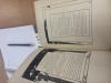
The pages of this edition feel laminated and the pages are fused together. The pages are fused with the intention of them being uncut from each other. I am unsure why this is aside from the fact that it was a common practice for books to be bound like this as it was cheaper to do, but the purposeful reasoning for requesting them stay uncut by the publisher implys that they had other intentions.
The illustrations are interesting because they jump at you throughout the entirety of the edition. This is due to the sharpness of the black contrasting with the white of the pages. It is an interesting effect and makes the edition stand out in its own way, however, the illustrations themselves at many points don’t make sense. Florence Lundborg doesn’t really align her illustrations with the text itself, and in so doing, makes the illustrations feel less alive and more just there for decoration and ornamentation. Also, she very heavily ripped off Aubrey Beardsley’s art style, and did it very poorly too. The linework is not as sharp as the style typically demands and many of the lines are a bit wavy. The picture posted in this description is a good example of illustrations not fitting moments of the poem. Lundborg depicts a military man with a shield and helment standing around a field of skulls and bones. The poem in this section references the "phantom caravan" and "the well Amid the Waste," which we can infer it is talking about death here, so the skulls and bones could have fit. The issue is that Lundborg's depiction of a soldier in the middle of war has nothing to with what is written on the page. She did this on previous pages too, depicting soldiers marching into war, preparing for battle, etc. and this war narrative she depicts through the illustrations does not allign with the langauge and the philosophy surrounding death that the poem's narrative presents.