
My selected edition is titled Rubáiyát of Omar Khayyám, authored by Omar Khayyám and translated by Edward FitzGerald. This particular edition holds 193 pages and was published in 1933 by Illustrated Editions Company, a publication company based in New York. This now-defunct publishing house lays claim to somewhere around four Rubáiyát gift book editions, published between the years 1930 and 1939, with the publishing house itself operating from somewhere around 1929 to 1942.
Of FitzGerald’s translations, this edition pulls from the first and fifth versions, and features a preface from FitzGerald. The first version of the translation occupies the majority of the book, with each stanza positioned independently on the left page, facing an illustrative interpretation on the right. The fifth version is featured unadorned and in its entirety in the pages following the conclusion of the first version.
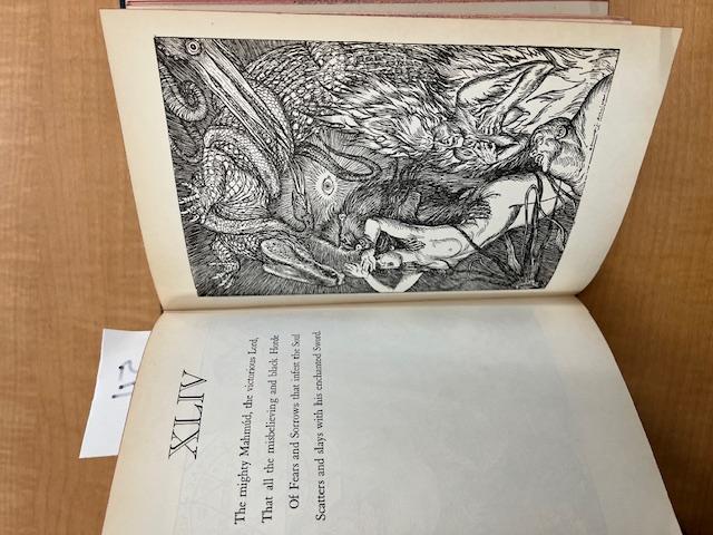
The illustrations themselves were crafted by Edmund J Sullivan, a British illustrator. Sullivan (1869-1933) was a prolific illustrator, who displayed a focus on graphic design, book illustration, and magazine illustration. His illustrative style is termed (by Wikipedia) a faux-Rococo style which blends elements of Rococo and the Grotesque. Sullivan’s illustrative style, both generally, and as featured in the Rubáiyát, does not utilize color, and is rendered fully in black and white. The elaborate drawings boast intricate line work and complement the themes and images present in FitzGerald’s translation of each respective stanza.
The illustration style struck me as particularly interesting as the images Sullivan creates embody a very natural flow; they present moments of both movement and stillness, and feature both human objects and animated objects. Thematically, the images emphasize the present motifs of drinking and the camaraderie it provides, lust, and mortality. The images of mortality are most prevalent, with skeletons and Grim Reaper-type figures appearing frequently. Interestingly, the depiction of the skeleton complementing stanza XXVI was featured as the cover art for the Grateful Dead’s 1971 live album bearing the same name. Across the illustrations, there is a divide between the nude form and clothed figures; the nude form is very reminiscent of the Renaissance impulse to depict the beauty of the feminine form, without overtly sexualising or fetishizing the figures, while the clothed figures, interestingly enough, wear clothing that seems almost reminiscent of traditional Russian garb.
The typeface used in this edition is relatively plain, with an emphasis on characters in a serif font of varying sizes. Interestingly, this edition does not make use of the stylized script that is present in other gift books. While this is not true of all gift books of this poem, there seem to be a fair few that feature text styles that are stylized to evoke an image of the Perso-Arabic script that the Persian language uses for its associated writing system. This imitation is notably absent from the edition I have chosen as the focus for this project, which instead uses a more generic text style.
The binding of this edition is simple, but quite beautiful. It is bound with a neutral color imitation leather, which extends onto the front and back of the book for an inch or two before joining with the cover of blue textured cloth. The front cover does not present the title or author, but instead presents a small imprinted image of a vase or some other handled vessel with a round body and long neck; a leafy vine arches over the vessel, ending in a flower. The image itself is pressed into the cloth; impressed red leather and gilt outlines grant the image color. The edges of the pages, though faded, are a similar shade of red to the color adorning the leaves.