Created by Maddie Meckley on Sat, 03/09/2024 - 23:20
Description:
Display explanation:
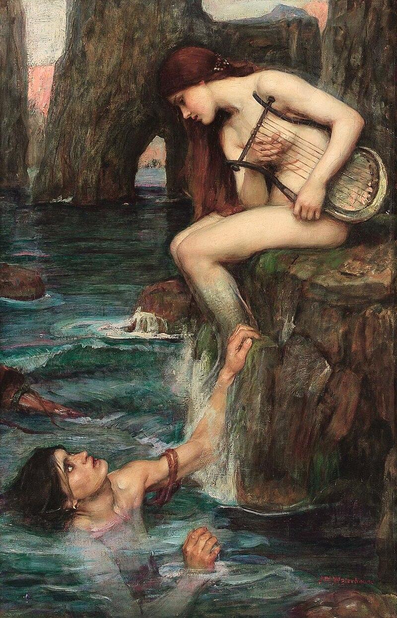
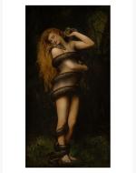
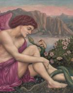
My installation would be set up in a kind of “maze” “-like way. To explain, the exhibit would be a box shape, it would be closed off from the rest of the museum. The walls are black on the outside but on the inside, they would correspond to the paintings. The paintings would be set up in different corners of the box so you can only see one painting at a time. I feel like it tells the story better that way. So, the box would be set up in three jagged sections each an equal size. There would be two doors, one labeled entrance and one exit. It would also be made apparent that you absolutely cannot go in the exit or out the entrance. I would make sure of no confusion by making the exit door only open from the inside. On the outside of the box, you would see the title, Tales, and Temptresses. The words are in bold letters, and the first word is in blue, the second in grey, and the third in pink. Walking into my installation you would automatically see The Siren. The painting is bolted to the floor but angled up so you can see it clearly. I think this is an interesting thing to do because you have to kind of strain to see it. As if you're looking down on the painting as the siren is doing to the man. This painting being the first you see is important, I feel like it drags you into the oncoming concepts. Like the siren is dragging in the man with her songs. It really sets the tone for the rest of the exhibit without spoiling it. The siren captures the essence of seduction as taken from the Lore of them. As one walks through the first part of the exhibit, one should be able to feel the allure of this first painting. On the wall side of things, the wall in this first corner would be ocean blue to match the painting along with an overhead soft light, and an actual lyre on a blue shelf mounted above the painting. As we walk to the second corner, a jagged hallway with low light is seen. As well as the wall’s paint transitioning from ocean blue to greys, blacks, and browns. As you make your way Lilith is revealed. She is meant to feel like the main focus of the exhibit, so her corner is bigger than the previous one and will be bigger than the final painting. Lilith’s room is painted in dark colors but lightened by the intricate lights placed around it. Lilith is placed in a golden frame and is centered on the wall, simply just on the wall. But surrounding her are two metal sculptures of snakes that look like the one in the painting. And in a glass enclosure underneath her is a real black snake. The room is also accompanied by various plants like small trees and ferns. This entire setting plays off of The Sirens with the more planty- or earthy- tones. As opposed to the ocean setting. As we leave Lilith and her snake we move down another small, jagged hallway the walls transition in color from the dark earthy tones to bright muted pinks and whites. In the third and final corner appears the painting of an angel dressed in pink is hanging from the ceiling. So, you have to look up to him. His room is covered in white clouds and sparkly lights. A complete contrast to the previous rooms. His painting may feature a snake, but it does not have a real one, instead it has a fake one that is also suspended amongst the clouds. There is low light in this room because the walls and clouds make the room light enough to not need any. This room should feel ethereal in a different way than the rest of the other rooms. As you go to the exit there is a small book where you can write your name along with a small survey in another book so you can tell which small corner was your favorite!
Installation Note:
Positioned at the entrance, "The Siren" beckons with its hypnotic allure. Bathed in hues of deep oceanic blues. This painting draws viewers into the depths of an aquatic realm. This is a really good contrast from the other two paintings I chose. I think this painting has more similarities than you see at first glance. Instead of the other figure in the painting being a snake, it is a siren. Sirens are historically known to be temptresses like how I explained about the snakes. In this painting they are outside again like the other two, I wanted to stick with the natural setting. It is both on the darker side and lighter side color-wise. There are dark spots but also highlighted areas, it's a perfect medium. The siren is bringing this man in, tempting him to come closer. She tricks him with her song. The Siren is a part of women’s sexuality. The portrayal of sirens as alluring women contributes to the association with sexuality. In many mythologies and artistic representations, sirens are depicted as feminine and often beautiful, emphasizing the power of their allure over men. This connects to broader cultural ideas about femininity, beauty, and desire. Transitioning seamlessly from the aquatic allure of The Siren, visitors encounter "Lilith" in the heart of the installation. This painting, infused with rich earth tones depicts Lilith, the mythical first wife of Adam, embodying strength, and rebellion. Lilith's spirit is reflected in the dirt landscape surrounding her contrasting with The Siren's aquatic realm. Viewers are encouraged to explore the intricate details that hint at Lilith's defiance and connection to nature. The snake being one of those details, the snake embodies her defiance. Lilith looks down at the snake on her shoulder almost in a loving way. She allows it to slither around her and even nuzzles into the head of it with her chin. They look to be as one, coexisting. With that idea in mind, we transition to The Angel and The Serpent. Positioned against a celestial backdrop of pinks and whites, this painting unveils an angelic figure entwined with a sinuous serpent. The spatial arrangement allows viewers to experience a seamless transition from Lilith's defiance to the peacefulness of The Angel with the Serpent. The soft hues create a sense of serenity, inviting viewers to reflect on the coexistence of divine and serpentine elements. The fact that the angel is also dressed in a “feminine” color is really interesting. The way the angel is gazing at the snake is something to pay attention to, he is gazing at the snake in the same way Lilith and the Siren are looking at their things. However, he could be getting tempted by the snake, and with him being an angel is too naive to see how it could be dangerous. The color choice of his wings and clothes also brings me to that conclusion as pink is usually an "innocent" color. As the viewer exits the exhibit they should feel educated on the sexuality of women.
De Morgan, Evelyn. The Angel and The Serpent. 1870-75
Accessed 16, February 2024
Waterhouse, John William. The Siren. 1900.
Accessed 16 February 2024.
Collier, John. Lilith. 1887.
https://en.wikipedia.org/wiki/Lilith_in_popular_culture#/media/File:Lilith_(John_Collier_pa
inting).jpg. Accessed 28 Jan. 2028.
Copyright:
Associated Place(s)
Featured in Exhibit:
Artist:
- “Multiple Artists


