
The edition of Rubáiyát of Omar Khayyám that I have selected is numbered as #39 in the Dr. Sigurd H. Peterson Memorial Collection of 101 versions of this poem. The cover has the title, Rubáiyát of Omar Khayyám, and the illustrator, Frank Brawngwyn ARA, listed, but no author of the poem. This leaving out of the author is clarified at the end of the text, which states, “This edition of the Rubiyat of Omar Khayyám is reprinted from Fitzgerald’s translation published in eighteen hundred and fifty-nine.” This edition was published in September of 1910 by T.N. Foulis, a Londoner whose publishing company was based in Edinburgh.
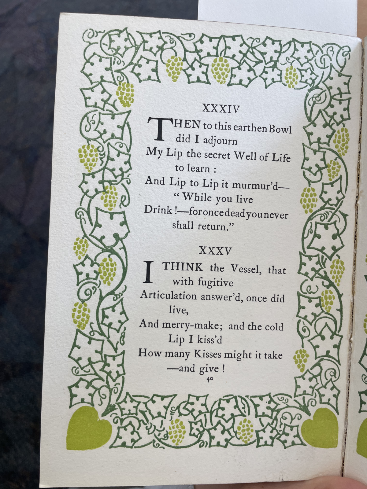
The pages of this edition feature beautiful borders in purple and two shades of green. These illustrations are fairly basic, featuring line work, hearts, and grapes. In addition to these decorative borders, there are five elaborate illustrations from Brawngwyn that correspond with a different line or stanza of the Rubáiyát. The cover features gold embellishments with some blue illustration. These illustrations on the cover page are the same as those in the text. If I had to guess, I would assume that the blue on the exterior once matched the purple on the interior and has faded with time and use. The inside covers are the same hue of purple as the illustrated borders and feature drawings of a city from the perspective of looking out from one’s own balcony. This carrying of purple throughout is interesting to observe.
The book is marked as having 71 pages. However, this does not include the illustration pages or the page that shares its spread. In all, the book has closer to 80 pages. The paper the main poem is written on is much thicker than that on which the illustrations are. These illustrations were made with oil paint and contain very vibrant colors. These illustrations are interesting because they are a depiction of the poem itself. If the recipient of this gift book were appreciative of fine art as well as poetry, this element would make it extra special.
These illustrations were one interesting element of this edition. There are eight illustrations that each correspond to a specific line of the poem. The gift book contains one of these images before the actual poem even begins, which leads the viewer/reader to understand that was is important about this edition.
The second quality I noticed that made this edition special was that the text was not modified. Formatting-wise, the first word of each stanza is written entirely in capital letters. The first letter of this first word is also written larger than the rest of the stanza. This adds emphasis to the idea that each stanza can stand alone. Rather than the poem only being understood as a complete unit, like much of modern poetry, any stanza could be shared without context of the surrounding stanzas, and it would still create meaning for the reader. However, the actual text was not modified in any way from Fitzgerald’s translation. It was simply a new release of an old edition with added illustrations. These illustrations all feature people wearing flowy clothes, and many show people wearing different forms of head coverings and wraps. In illustration IV, there is an image of a man and woman kissing, and the woman’s skin is notably lighter than the other people depicted throughout the book. Her outfit is also different and features lighter colors than the other outfits seen in this text.
The third quality that was interesting about this edition was the page's borders. Each border contains grapes in the design, which ties into the poem well. The poem itself spends a lot of time discussing wine and the frailty of life, but it also skeptically discusses religion. The grape design ties both into the location of the poem’s creation, with grapes flourishing in a Mediterranean climate, and some topics of the poem itself, those being wine and religion. This grape imagery is both an homage to the content of the poem and its origin.