

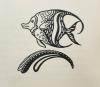
This illustration found in the bottom left-hand corner of the second page of "The Fisherman and His Soul", portrays a small delicate design to make the readers keep swimming through the story. Titled Fish Out of Water, the artist captures the essence of a fish with a timeless and minimalist approach. The simplicity of the art piece helps illustrate the beginning of the tale, where the fisherman spends his days out on the water, fishing in order to make a living. Because of the fisherman being unfulfilled with his fishing career perhaps that is why the illustrator Theodore Nadejen did not add color into this piece.
The fish is black and white, an ornament to the page, and it makes the moment more powerful and clear for the readers as it assists with the mental visualization of the events in the story. Nadejen's illustration of the fish seems to depict some of the illustration style called art deco, you can see that in this piece where the fish is made up of multiple shapes and sizes, the gaps between the shapes and lines helps create dimension which overall gives more meaning to it. The style of art deco is a simple looking style, but difficult to conjure. The artist has skillfully made up a bold and interpretive piece, by paying malicious attention to detail and patterns. The captivating artwork is made up of distinguishing features of simple, clean looking shapes, often with an outlined style, usually the size is ornament and uses geometrical shapes to style it in order to give dimension. He uses art deco to make a small art piece look very complex, the fish is jumping out of the water and into the page.
What stands out to me more specifically about this illustration is the type of fish that he chose to do, this kind of fish is familiar and used often in designs that are tropical. It reminds me of henna tattoo designs at beach stands, carvings in wooden crafts, or in the movie Nemo the character Dory. However, the artist Nadejen took time to make this piece memorable by laying intricate details in the design of the body of the fish, making small little "c" like marks in order to resemble scales, sections of emptiness, and others completely blacked out. There is a lot of detail, or lack of it that makes the illustration powerful and open to interpretation. Personally, I like how the top and bottom fin are shaped like the letter C and curved into the tail. The wave like part of the illustration underneath the fish raises questions for me. Is the artist trying to send a message that the fisherman is like the phrase a "fish out of water"? What was the purpose in adding the little wave? Why did he decide to use the design he did on the fish as well as the wave?