

The edition of Omar Khayyam's Rubáiyát that I have chosen is a 1946 publication produced by the Grosset & Dunlap publishing house. These details are included in a small attribution behind the cover page of this edition, alongside the notation that the volume was "Printed in the United States of America". As Grosset & Dunlap was based in New York City, this is no surprise. Another page found in the back of the book describes the printing process in great detail. Printed by The Meehan-Tooker Company, Inc., the copies were then sent to another location, H. Wolff Book Manufacturing Co. to be bound. However, it is the style and process of which this edition of the Rubáiyát came to be where the true artistry lies.
Printed through the use of offset lithography, this heavily-illustrated edition was a feat to accomplish with such precision. This process is accomplished by transferring an image or text onto an intermediary plate, which is then used to replicate the original content onto a new piece of paper or surface. Through this exercise, the original is reversed twice, therefore ending up in it's beginning state. The switch to offset lithography became a very popular way of producing books, as it was cheaper and easier to create a larger sum of products. In 1946 offset lithography would have been the standard printing practice for a gift book such as the Rubáiyát. More affordable printing costs would have led to a decreased market price, allowing a larger audience to purchase the Rubáiyát, as well as compounding it's popularity as a gift book.
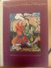
Design and typography was handled by an A. P. Tedesco. Anthony Phillip Tedesco worked on many publications, even writing his own The Relationship Between Type and Illustration in Books and Book Jackets in 1948, just a couple of years after this edition was finished. Tedesco selected 24 Weiss type, which would have been appointed for it's artistic appearance and slightly bolded ink lines. Tedesco likely picked this script to work alongside the original illustrations done by Sarkis Katchadourian for this book. Paired with the wine-colored cloth cover, even closed on a bookshelf, this tome could be recognized as a thing of beauty by visitors.
Katchadourian is an internationally recognized artist, known for his recreations of historical murals and cave paintings across India. As he has his work displayed in many reputable places, such as the Metropolitan Museum of Art, it is a very special inclusion to have his original images within the pages of this Rubáiyát. His intentional scenes allow the stanzas to gain fluidity, and add a depth of beauty alongside Omar Khayyam's writing. While the printed illustrations within the pages of this tome would have been created through offset lithography as well, it is easy to see the detail and care placed by the artist in the creation of the original images. All of these attributions to this edition of Fitzgerald's translation of Omar Khayyam's writing comes together in a brightly bound piece of art. Each step of the way, the pages of this volume were handled and created with vigilance.