
Magazine and Book Illustrations for The Were-Wolf
Clemence Housman published The Were-Wolf twice in her lifetime: first as a story in a popular magazine and then as a book. Each time the novella was accompanied by a unique set of illustrations that shaped its reception. This essay examines the contrasting meanings for The Were-Wolf created by their accompanying illustrations, modes of production, and publication venues.
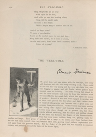
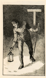
Figure 1. Left: Page layout for "The Were-Wolf" in Atalanta. Centre: Detail of historiated initial letter by Everard Hopkins. Right: Enlarged bottom right corner of the initial letter, showing the cross-screen lines and dots creating tonal gradations in the halftone engraving.
Housman’s gothic tale first met a mass audience in December 1890 when it appeared as the feature story of the Christmas number of Atalanta, a progressive magazine for girls and women. Everard Hopkins, a professional artist whose income derived principally from periodical commissions, illustrated Housman’s story. The selection of the artist and the number and kind of illustrations were editorial decisions. The author would likely not have seen Hopkins’s illustrations prior to the story’s publication.
Hopkins created his six illustrations as wash drawings. These were reproduced using a photomechanical process called halftone engraving, which allowed for grayscale and tonal shades within the black-and-white palette. In Hopkins’s initial letter (fig. 1), for example, the grayscale tones were produced using a cross-line screen that remediated the artist’s drawing into a series of dots.
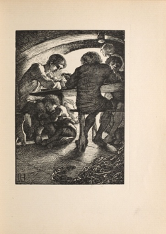
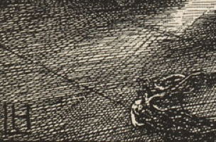
Figure 2. Left: "Rol's Worship," wood engraved by Clemence Housman after Laurence Housman’s design. Right: Detail of lower left corner showing the shading effects made by the wood engraver's differently spaced diagonal cuts and gouges.
In contrast, when Clemence Housman published The Were-Wolf in 1896 as a stand-alone book with John Lane at The Bodley Head, she collaborated with her brother Laurence Housman in the production of the illustrations. The COVE edition of The Were-Wolf honours and remediates the siblings’ artistic collaboration by using this publication as its source text. A highly skilled wood engraver, Clemence engraved the six full-page pictures, decorated title page, and initial letter after Laurence’s designs.
Wood engraving is a linear art, so these illustrations communicate using a black-and-white register in which shades can only be created by laying a series of lines—either parallel or cross-hatched—beside each other. The closer the lines, the darker the shading effect; more widely spaced lines create a lighter, more open effect. Each inked black line requires two incisions by the engraver, who works on the woodblock in relief, carving out the negative spaces or “whites” of the drawing. In “Rol’s Worship,” for example (fig. 2), Clemence had to excavate the woodblock deeply to create the white background against which the roof beams and figures stand out, and to establish the light source by which the shadows are cast.
Figure 3. Laurence Housman's repeating pomegranate motif for The Were-Wolf
As a professional book artist, Laurence Housman also designed the binding and layouts, integrating the decorations with a repeating pomegranate motif and framing the typography, styled in Caslon font, with wide margins (fig. 3). As Danielle DiFruscia notes in her annotation to the title page in the COVE edition of The Were-Wolf, the pomegranate is an ancient symbol for blood and death, but a split fruit can also symbolize resurrection and new life. The prominence of the open pomegranate motif introducing the book’s contents is thus, like the werewolf herself, a hybrid and contradictory symbol representing both death and life. The reddish-orange ink of the title page emphasizes the importance of the two-sided pomegranate to the book’s meaning. The segregation of image and text also expresses conjoined duality in each medium’s distinct way of conveying ideas. The full-page illustrations are interleaved throughout the narrative, each one prefaced by a blank page and half-title, so that the reader’s textual journey is periodically interrupted by pictorial material demanding close attention.
The care in production and the quality of design signal that The Were-Wolf participated in the fin-de-siècle Book Beautiful movement, even though The Bodley Head was a trade publisher rather than a fine press. John Lane created a specific marketing niche for his publishing house and marketed it aggressively. People who bought The Bodley Head Were-Wolf cared about books as beautiful objects. They were, or thought of themselves as, aesthetically and politically avant-garde, particularly when it came to issues of sex and gender. In addition to his controversial decadent magazine, The Yellow Book, John Lane was known for his publication of New Woman fiction, and Housman’s The Were-Wolf was a good fit with this aspect of his list as well. The meanings generated for The Were-Wolf in the Bodley Head edition therefore differed from those created in the context of its Atalanta publication.
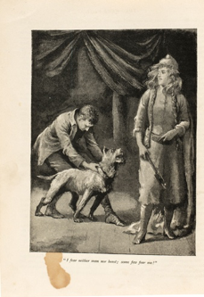
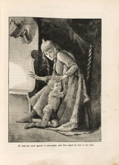
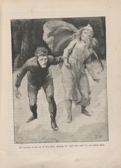
Figure 4. Everard Hopkins's illustrations for “The Were-Wolf,” focussing on the figure of White Fell
In keeping with its publishing context as the Christmas number in a popular girls’ magazine, Everard Hopkins’s illustrations for “The Were-Wolf” concentrate on the story’s exploration of roles for women and its religious themes of sacrifice and redemption. Three of Hopkins’s four full-page illustrations for the Atalanta magazine publication focus on the character of White Fell, the titular werewolf. Given both the targeted female audience and the character’s title role, this visual prominence makes sense. However, it is also important to note that Hopkins represents White Fell as an aggressive, non-maternal, and independent woman. She grips her battle axe in the first picture, responds menacingly to little Rol’s embrace in the second, and resists Christian’s grasp in the last (fig. 4). As a visual sequence, this representation of White Fell would likely resonate with Atalanta’s readers as a negative portrayal of the New Woman. As Rechelle Christie observes, Hopkins’s White Fell presents “the frightening stereotype of wayward femininity as she transgresses the traditional notions of Victorian female identity” (60).
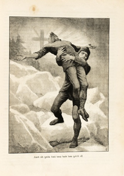
Figure 5. Everard Hopkins, last full-page illustration for "The Were-Wolf" in Atalanta
Hopkins restores patriarchal order in his last full-page image, which corresponds to the narrative’s final lines while also conforming to Victorian religious discourse and the expectations of an Atalanta Christmas number. At the end of the story, Sweyn returns home bearing the weight of his dead brother, “knowing that to him Christian had been as Christ, and had suffered and died to save him from his sins” (123). Hopkins’s illuminated cross radiating light behind the brothers, and the image of Sweyn metaphorically “taking up his cross” in order to follow his twin’s spiritual path, cues to the introductory initial letter (fig. 1). As DiFruscia points out, “The ‘T’ resembles the iconography of a truncated cross. Looming behind his shoulder at the moment of discovery, it foreshadows Christian's martyrdom” and alerts the reader to the story’s narrative of suffering, sacrifice, and salvation. The final picture confirms this reading.

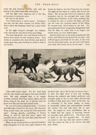
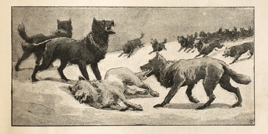
Figure 6. Everard Hopkins. Left: Initial letter. Centre: Final page layout. Right: Inset illustration of the wolf pack.
The wolf tracks in the snow illuminated by Christian’s lantern in the initial letter also connect to the final picture—an inset illustration of the wolf pack closing in on the corpse of a white wolf lying against a snow bank (fig. 6). These two images are the only glimpses Hopkins offers readers of White Fell’s other, non-human form. The artist’s pictorial series frames Housman’s story as one concerned with restoring the hierarchized polarities on which the social order depends: man/woman, human/animal, immortal/mortal.
The series of six full-page illustrations in the collaborative edition produced by Clemence and Laurence Housman for The Bodley Head edition tells a different story. Here, rather than opposing dichotomies, the visual interest is in the fluidity of boundaries and the possibilities of transformation, with attention focused on the androgynous Christian and the hybrid White Fell. Christian appears in all but one of the six illustrations and is represented together with White Fell in three of them.
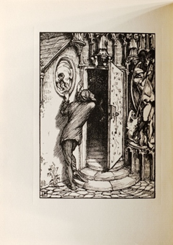
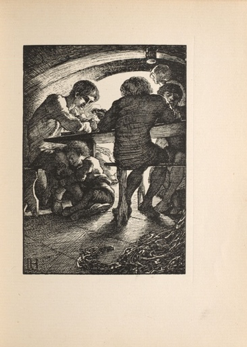
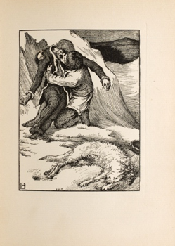
Figure 7. Wood engraved by Clemence Housman after Laurence Housman’s designs. Left: "Holy Water"; Centre: "Rol's Worship”; Right: “Sweyn’s Finding.”
The first two pictures—the frontispiece, “Holy Water,” and the initial full-page illustration, “Rol’s Worship”—contrast the opposing forms of masculinity that the narrative seeks to resolve (fig. 7). In the frontispiece, the slender Christian clings to the relief of the pelican plucking blood from her breast to feed her young, foreshadowing Christian’s Christ-like act of self-sacrifice as his own death blood transforms into holy water, kills the werewolf, and redeems his brother Sweyn. The narrative consistently contrasts Christian’s so-called feminine traits—slim build, endurance, self-sacrificing love, and spiritual intuition—with his twin’s superior physical strength, assumed dominance, rationality, and virile masculinity (his name is a homophone for “swain,” a word for “ardent suitor”). In both title and depiction, “Rol’s Worship” warns of the danger of overly valuing the material things of this world, such as a man’s muscles (fig. 7).
The narrative reinforces this by portraying Little Rol, who worships and wishes to emulate Sweyn’s hyper-masculinity, as White Fell’s first victim. Indeed, the supposedly weak Christian becomes the hero of the story, representing a superior form of humanity by his androgynous blending of genders. The final plate, “Sweyn’s Finding,” confirms this meaning by bringing the powerful Sweyn literally to his knees as he embraces the body of his brother and gains insight into his own limitations and the need to be more like Christian: “Because the outward man lacked perfection and strength equal to his, he had taken the love and worship of that great pure heart as his due; he, so unworthy in the inner reality, so mean, so despicable, callous, and contemptuous towards the brother who had laid down his life to save him” (121-22). Together, Clemence Housman’s language and Laurence Housman’s illustration call into question Victorian gender stereotypes and patriarchal ideals.
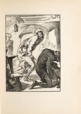
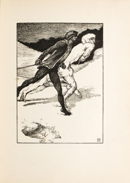
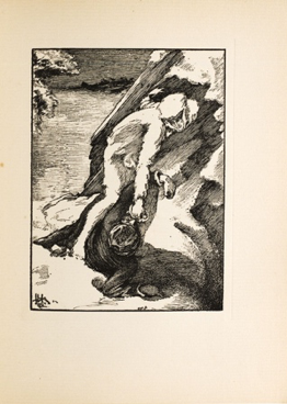
Figure 8. Wood engraved by Clemence Housman after Laurence Housman’s designs. Left: “White Fell’s Escape”; Centre: "The Race"; Right: "The Finish.”
The narrative’s titular character, White Fell, dominates the Housman siblings’ sequence of illustrations in a way very different from Hopkins’s pictorial series for Atalanta. In the Bodley Head edition, White Fell is not represented as a masculinized New Woman, but rather as a hybrid creature, living perpetually on the edge of transformation (fig. 8). Her pairing with Christian in the three interior illustrations visually emphasizes their mirroring aspects as fluid beings incorporating oppositions (man/woman, human/animal, human/divine) within their very bodies (Kooistra, passim). They die and transform at the same moment, in order that Sweyn can learn from their deaths. Visually, the final image places Sweyn between the spiritual man and the material animal, suggesting that he now combines these two elements in his own being (fig. 7).
But White Fell is more than mere animal. Like Christian, she incorporates a supernatural and alien fluidity important to the story’s central concerns. In her survey of lycanthropic literature, Chantal du Coudray claims that the Housman siblings’ illustration “The Race” (fig. 8) is “the only visual representation of human into wolf to appear in the nineteenth century” (4). This representation calls attention to the critically important theme of transformation in The Bodley Head edition of The Were-Wolf. Transformation emerges in the narrative’s pagan and Christian discourses of incarnation; in its representations of the sexed and gendered body; and in its vision of a human condition “too expansive to be contained by the limited form of a sole man, […] a new embodiment infinite as the stars” (106-7).
NOTE: Each illustration created by Everard Hopkins for the Atalanta (1890) magazine version of The Were-Wolf, and each illustration created by Laurence Housman and engraved by Clemence Housman for the Bodley Head edition (1896) is separately annotated in the COVE Electronic Edition. These images may be filtered using the tag “illustration” or discovered by clicking on the highlighted caption or quotation in the text. Images may be studied in greater depth, compared, and downloaded, at The Were-Wolf Gallery: http://omeka-s.rula.info/s/werewolf/page/welcome.
Lorraine Janzen Kooistra, Ryerson University, 2018
Citation: Kooistra, Lorraine Janzen. “Magazine and Book Illustrations for The Were-Wolf.” Clemence Housman’s The Were-Wolf, edited by Lorraine Janzen Kooistra et al. COVE Editions, 2018. https://editions.covecollective.org/edition/were-wolf/magazine-and-book-...
Works Cited
Christie, Rechelle. “The Politics of Representation and Illustration in Clemence Housman’s The Were-Wolf.” Housman Society Journal, vol. 33, 2007, pp. 54-67.
DiFruscia, Danielle. Editorial Annotations to Clemence Housman’s The Were-Wolf, edited by Lorraine Janzen Kooistra, Danielle DiFruscia, et al. COVE Editions, 2018. https://editions.covecollective.org/edition/were-wolf/were-wolf
Du Coudray, Chantelle. “Upright Citizens on All Fours: Nineteenth-Century Identity and the Image of the Werewolf.” Nineteenth-Century Contexts, vol. 24, no. 1, 2002, pp. 1-16. http://resolver.scholarsportal.info/resolve/08905495/v24i0001/1_ucoafnatiotw.xml
Housman, Clemence. “The Were-Wolf.” Illustrated by Everard Hopkins. Atalanta, vol 4, no. 39, Dec. 1890, pp. 132-156.
---. The Were-Wolf. With 6 illustrations by Laurence Housman engraved by Clemence Housman. John Lane Bodley Head, 1896.
Kooistra, Lorraine Janzen. “Clemence Housman’s The Were-Wolf: Querying Transgression, Seeking Transformation.” Forthcoming in Victorian Review, 2018.